R package to visualize individual prediction performance
2022-05-14: Submitted package to CRAN, await manual check.
Depending on the specific research topic and personal preferences, the perceived (dis-)advantages are probably different.
predictMe is an easy way in R to visually explore possible (dis-)advantages of the individual prediction performance of any algorithm, as long as the outcome is either continuous or binary.
There is no quick and easy way so far (to the best of my knowledge) to evaluate the performance of a machine learning (ML) algorithm, as it pertains to the individual level. That is what the ‘Me’ stands for in the predictMe package. That is, the ‘individual’ client, e.g., the patient, who is claimed by ML researchers to be the main beneficiary of ML research.
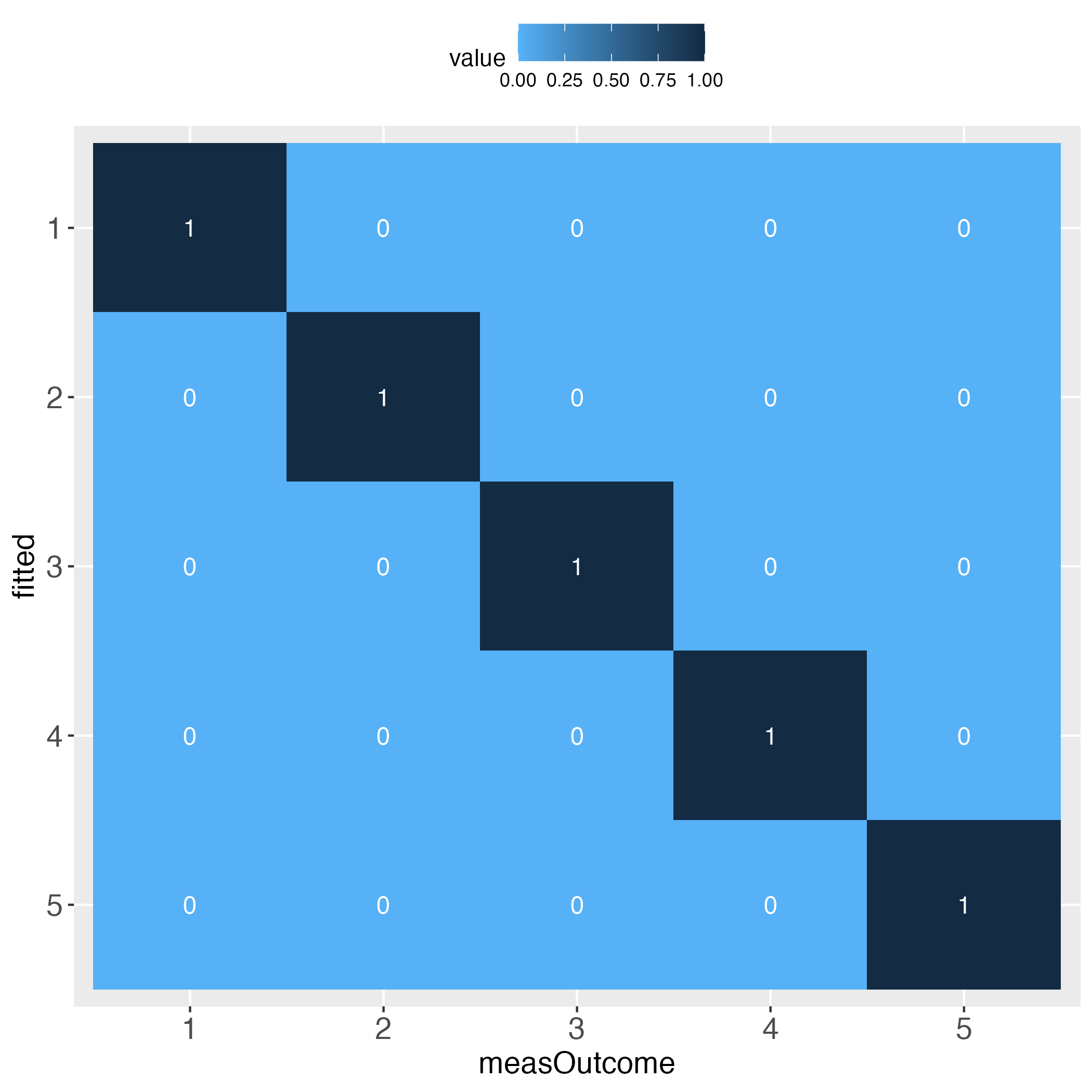
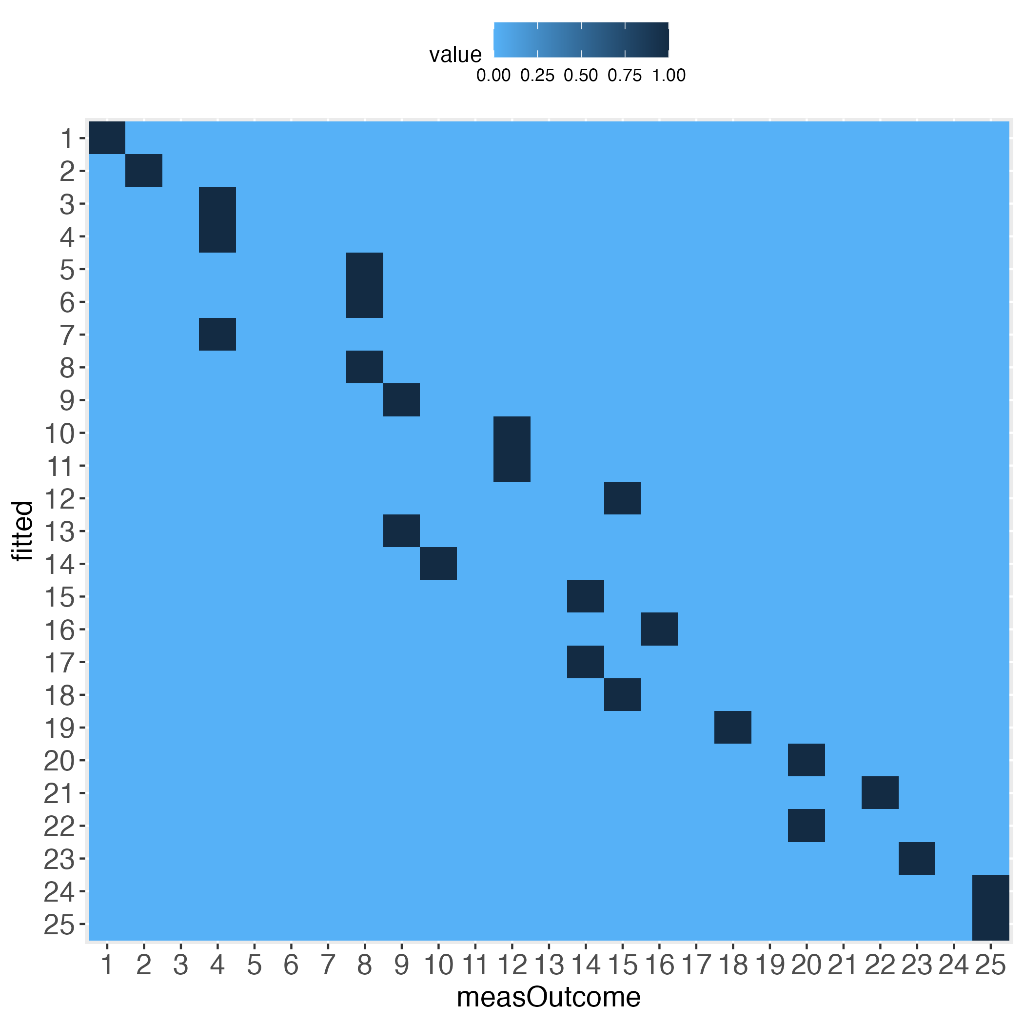
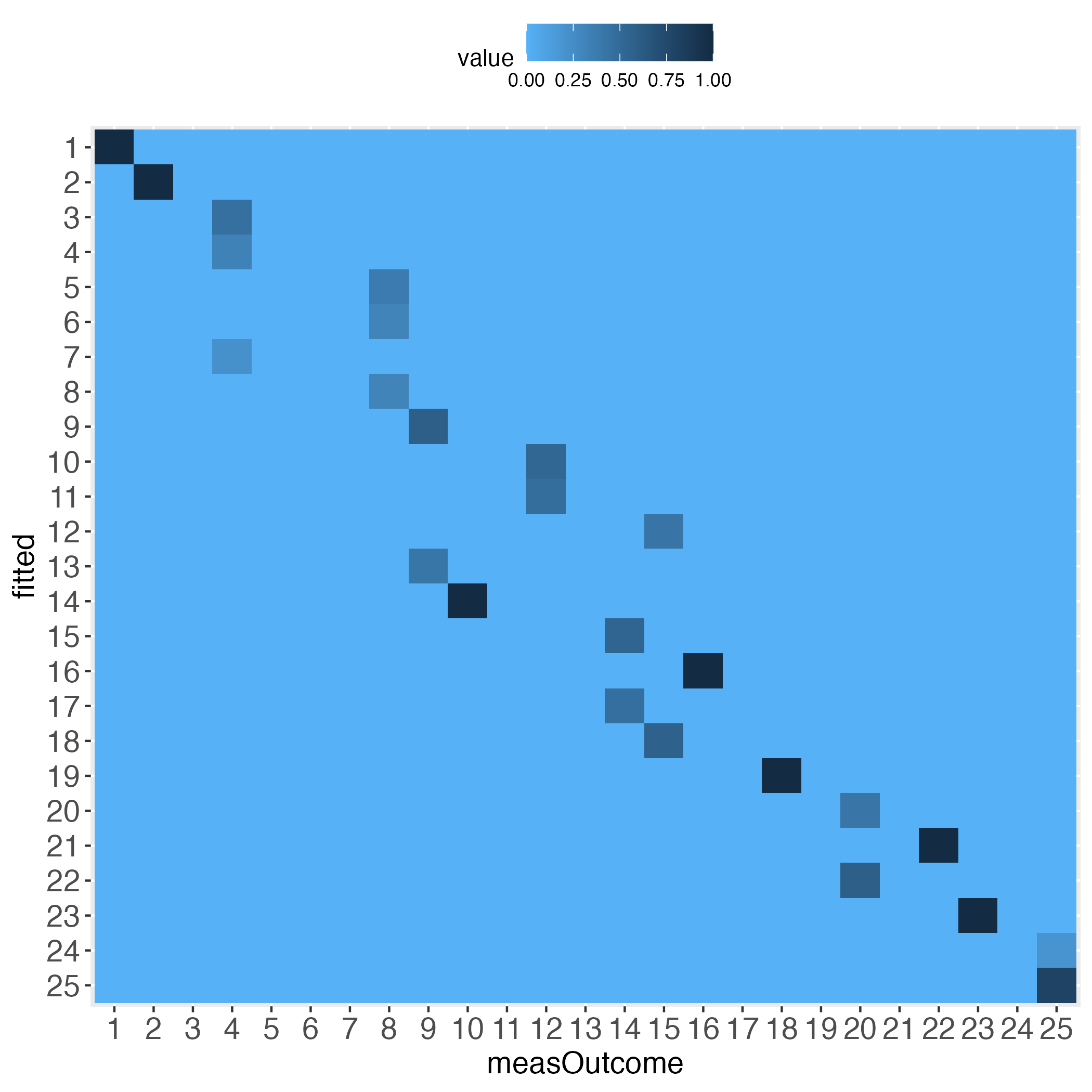
Without further ado, let’s start at the end: The main result of the predictMe package.
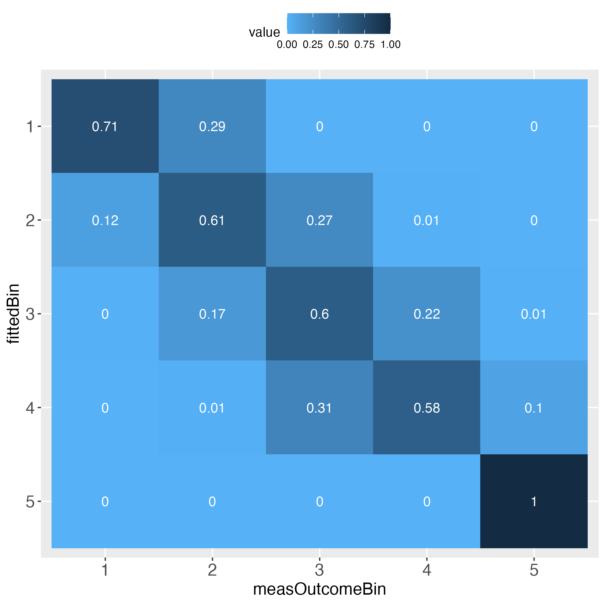
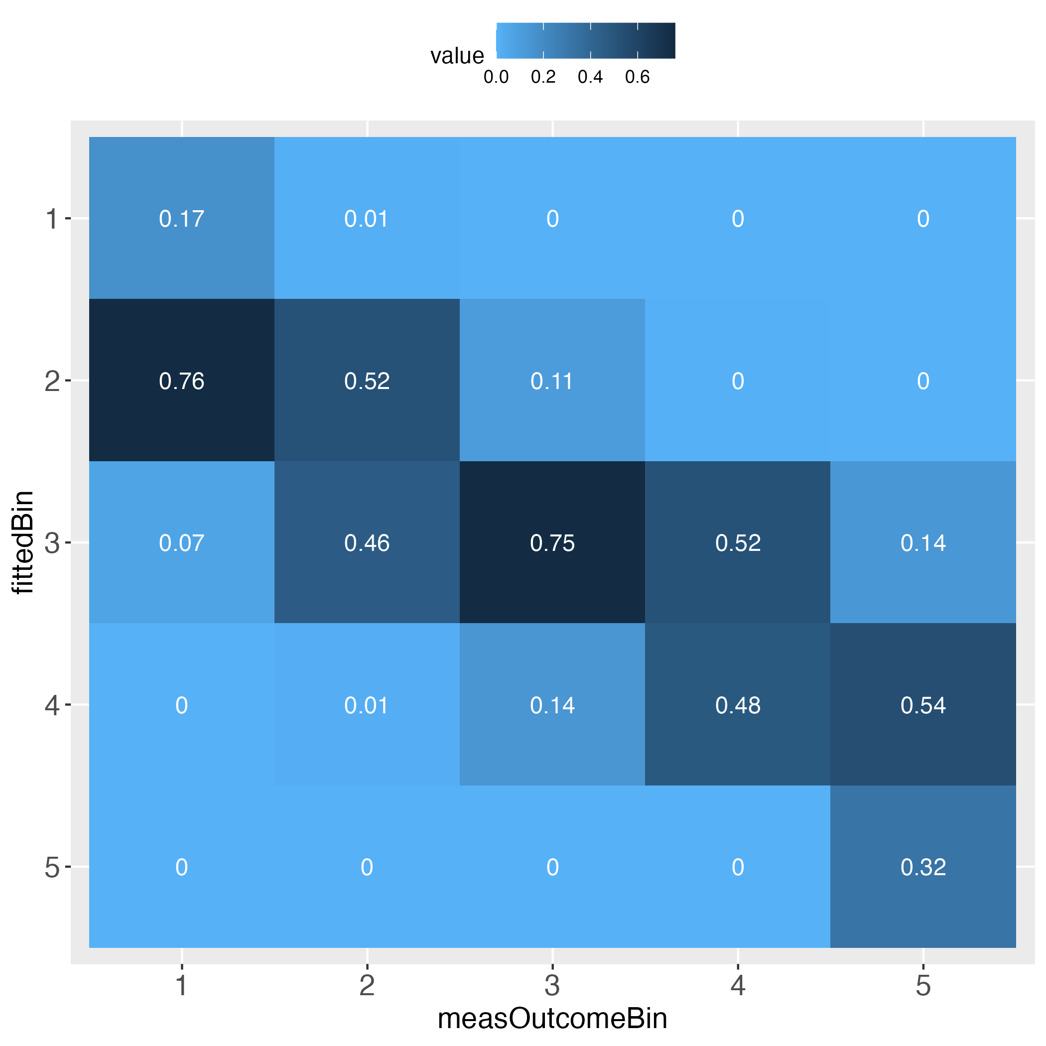
The performance evaluation heatmap instantly and comprehensibly displays all strengths and weaknesses of the predictions. A perfect performance (only theoretically possible) has the value 1 across the diagonal, whereas the worst performance has the value 0 across the diagonal. This rule applies to both of the pairwise plots. Plots must come in a pair, because one perspective makes no sense without its complementary perspective.
Perfect prediction is practically impossible (in a probabilistic world). Obviously then, we must ask how far away from perfection is tolerable, in other words, how close to perfection can we get? Both heatmaps visualize how often and how far away the algorithm failed to hit the bull’s eye of each of the compared bins. The user can determine the number of bins and whether the relative frequencies of bin concordance shall be displayed in each cell.
BEWARE: Many researchers are strongly opposed to the binning of continuous data, including me. However, sometimes the benefits may outweigh the flaws (knowing that flawless methods do not exist). I emphasize that the predictMe package provides previously unavailable and potentially important visual information. I therefore argue that some data information loss or reduced statistical power (due to binning) appear not as relevant here, compared to a method that evaluates prediction performance numerically, as opposed to visually. This opinion of mine partly draws from the notion of methodological pluralism (Levitt et al., 2020).
Please pay attention to the legend on top of each heatmap: Darkest blue is the overall highest percentage of bin concordance. In the left plot this is 1 (bottom right), whereas in the right plot it is 0.76 (row 2, left).
library(predictMe)# Simulate data set with continuous outcome (use all default values)
dfContinuous <- quickSim()
# Use multiple linear regression as algorithm to predict the outcome.
lmRes <- lm(y~x1+x2,data=dfContinuous)
# Extract measured outcome and the predicted outcome (fitted values)
# from the regression output, put both in a data.frame.
lmDf <- data.frame(measOutcome=lmRes$model$y,
fitted=lmRes$fitted.values)
# Generate 5 equal bins (transformed outcome 0-100, bin width 20, # yields 5 bins).
x100c <- binContinuous(x=lmDf, measColumn = 1, binWidth = 20)Important: The function binContinuous rescales the original outcome scale (via linear transformation), so that it ranges between 0 and 100. As emphasized in the Details of the R documentation of this function, if any of the extreme values of the original scale have not been obtained, e.g., none of the study participants selected the value 1 on a scale between 1 and 6, then the user will have to pass the full original scale to the function binContinuous, using the function argument range_x, e.g., range_x = c(1, 6). If the extreme values have been obtained, the user may ignore the argument range_x, meaning that binContinuous will compute the range internally and use the result for transforming the scale.
Let’s get an impression of the output data, which is part of x100c (see previous code block):
# Show some lines of the data:
head(x100c[["xTrans"]])
Output in R console
measOutcomeBin fittedBin measOutcome fitted diff xAxisIds absBinDiff
1 3 3 49.07609 57.74684 -8.6707498 1 0
2 3 4 44.05657 63.12596 -19.0693914 2 1
3 3 2 52.56371 36.47623 16.0874868 3 1
4 4 4 68.05227 63.98939 4.0628725 4 0
5 3 3 52.96387 53.83204 -0.8681698 5 0
6 2 2 36.07562 28.75503 7.3205928 6 0Columns measOutcomeBin and fittedBin are plotted against one another in the introductory heatmaps.
Columns measOutcome and fitted are the measured and predicted outcome, respectively.
The column diff displays the difference between the columns measOutcome and fitted. The column xAxisIds displays the unique identifier of each individual, which may be used as x-axis in the predictMe function makeDiffPlot (see below).
Let’s see what the function makeTablePlot produces.
# Demand the visualized performance, using makeTablePlot
outLs <- makeTablePlot(x100c[["xTrans"]][,1:2], measColumn = 1, plot = TRUE)
# Display names of the resulting list
cbind(names(outLs))
Output in R console
[,1]
[1,] "totalCountTable"
[2,] "rowSumTable"
[3,] "colSumTable"
[4,] "rowSumTable_melt"
[5,] "colSumTable_melt"
[6,] "rowSumTable_plot"
[7,] "colSumTable_plot"Let’s have a look at the total counts overview:
# Display total count table
outLs$totalCountTable
Output in R console
measOutcomeBin
fittedBin 1 2 3 4 5
1 5 2 0 0 0
2 22 114 50 1 0
3 2 101 350 129 5
4 0 3 64 120 20
5 0 0 0 0 12The rows (fittedBin) display how many of the predicted outcome values fall into each bin (binWidth = 20 = 5 bins: 0-20, >20-40, >40-60, >60-80, >80-100), and how these bins correspond to the same bins of the measured outcome values (measOutcomeBin). We instantly see that there are numbers outside the diagonal, which is normal. What we want to know is whether the algorithm still did a ‘good enough’ job, both overall and in detail. For instance, categories 1, 4 and 5 appear problematic insofar, as one total count outside of the diagonal is greater than the number on the diagonal, e.g., bin no.1 displays 5 times bull’s eye, but 22 times next to bull’s eye, and 2 times a failure by even 2 bins.
The next two tables display the relative frequencies of the total count table. First, taking the perspective of each row (each row sums up to 1). This is displayed in the introductory heatmap on the left.
# Display row sum table
outLs$rowSumTable
Output in R console
measOutcomeBin
fittedBin 1 2 3 4 5
1 0.714285714 0.285714286 0.000000000 0.000000000 0.000000000
2 0.117647059 0.609625668 0.267379679 0.005347594 0.000000000
3 0.003407155 0.172061329 0.596252129 0.219761499 0.008517888
4 0.000000000 0.014492754 0.309178744 0.579710145 0.096618357
5 0.000000000 0.000000000 0.000000000 0.000000000 1.000000000Second, taking the perspective of each column (each column sums up to 1). This is displayed in the introductory heatmap on the right.
# Display column sum table
outLs$colSumTable
Output in R console
measOutcomeBin
fittedBin 1 2 3 4 5
1 0.172413793 0.009090909 0.000000000 0.000000000 0.000000000
2 0.758620690 0.518181818 0.107758621 0.004000000 0.000000000
3 0.068965517 0.459090909 0.754310345 0.516000000 0.135135135
4 0.000000000 0.013636364 0.137931034 0.480000000 0.540540541
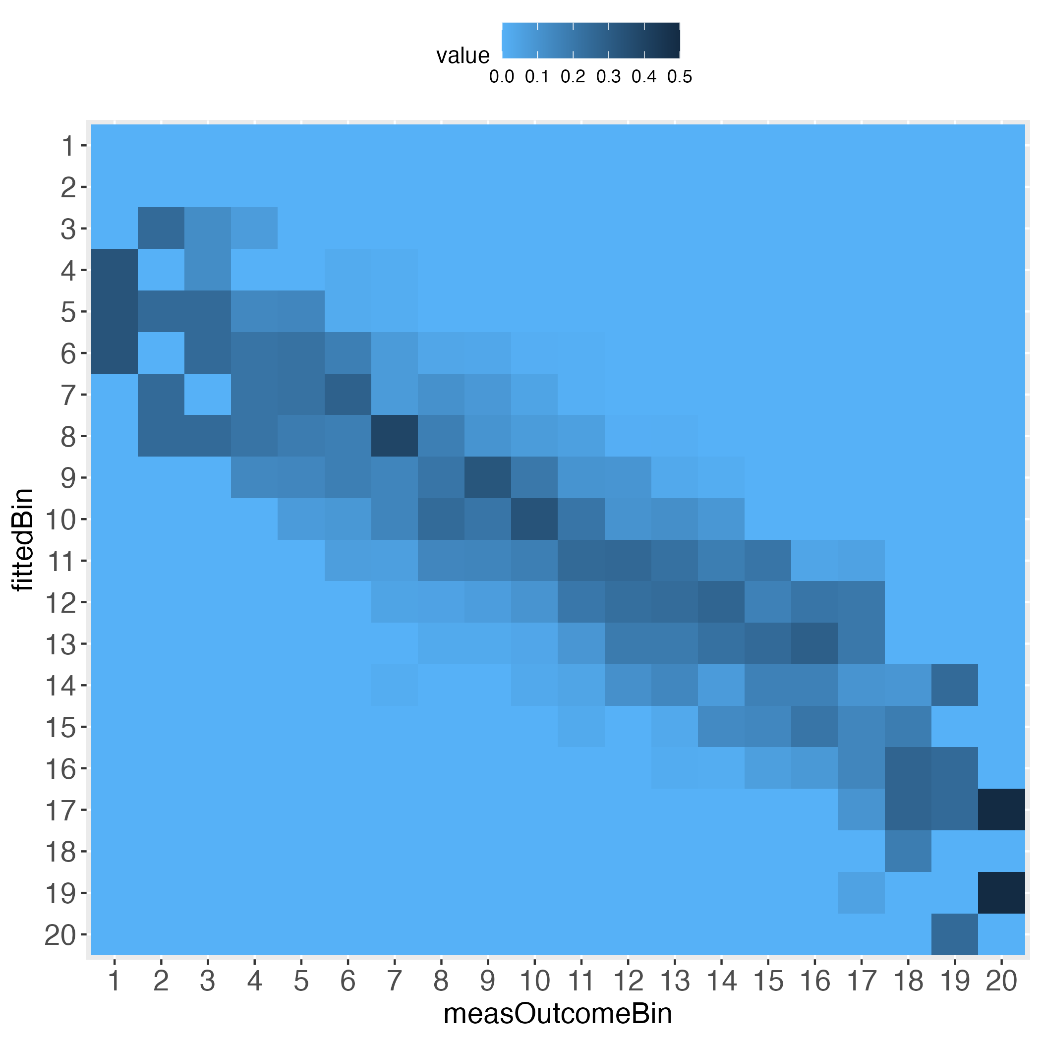
5 0.000000000 0.000000000 0.000000000 0.000000000 0.324324324Depending on how many bins the user selected, the heatmaps’ information approximates the prediction performance on the individual level. For instance, set binWidth to 5 (instead of 20), to produce 20 bins (instead of 5 bins).
# Generate 20 equal bins.
x100c5 <- binContinuous(x=lmDf, measColumn = 1, binWidth = 5)
# Demand the visualized performance, using makeTablePlot. Setting plotCellRes
# (Res = results) to FALSE means to not print the results into the cells.
outLs5 <- makeTablePlot(x100c5[["xTrans"]][,1:2], measColumn = 1,
                        plot = TRUE, plotCellRes = FALSE)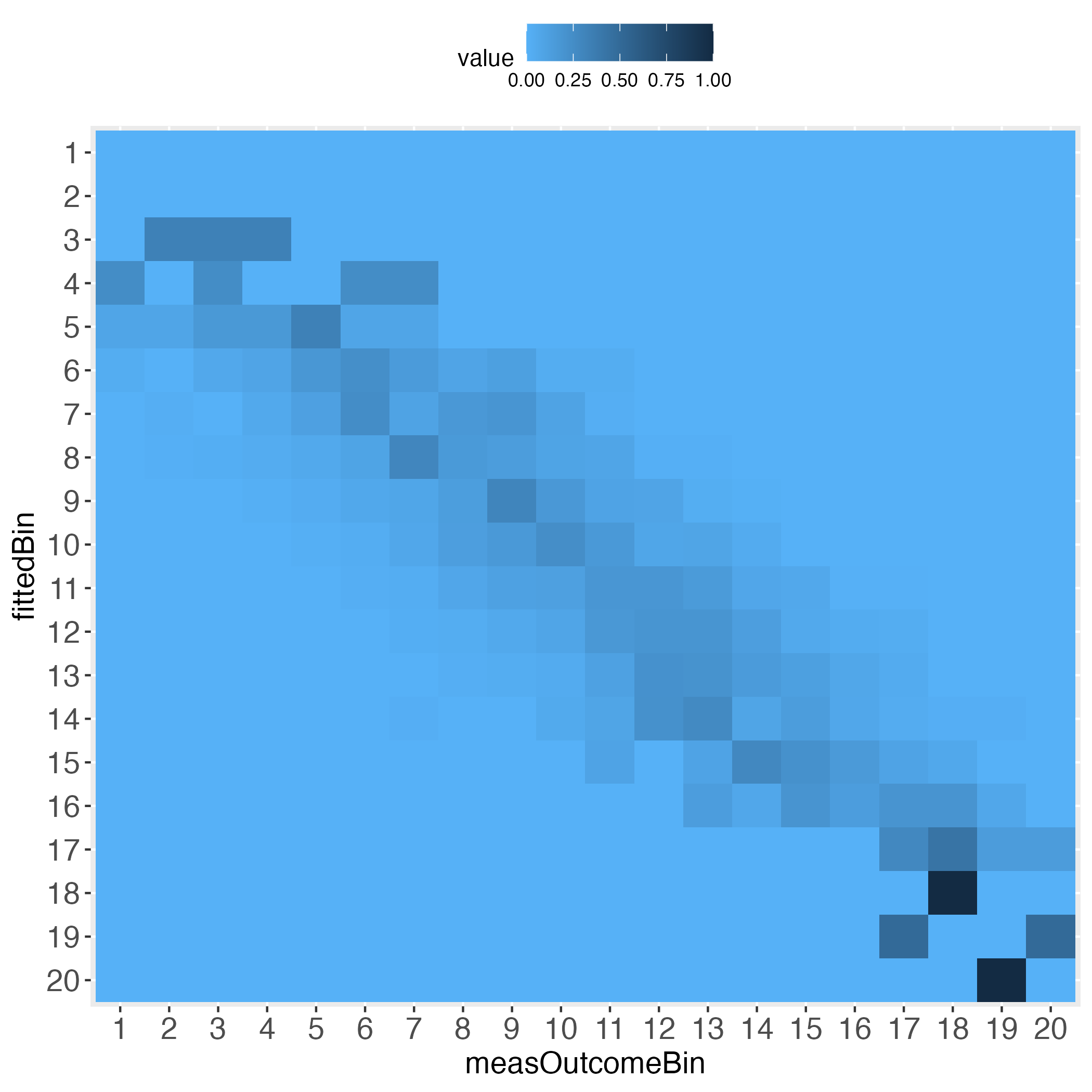
Approximating the individual level prediction performance is one way to go. To complement this, the user may want to directly plot the individual deviations from the zero difference line (deterministically perfect prediction). This can be done with the makeDiffPlot function.
# Demand the visualized differences, using makeDiffPlot
outDiffLs <- makeDiffPlot(x100c[["xTrans"]][,5:6], idCol = 2)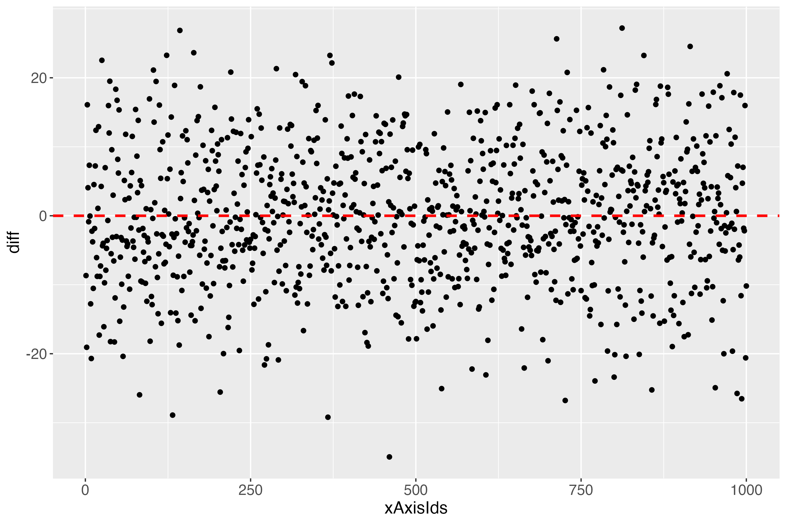
The x-axis (xAxisIds) shows all subjects, in this simulated data set: 1000. The y-axis (diff) shows the differences between the measures and the predicted outcome of each subject, using the linearly transformed scale between 0 and 100. The red dashed line shows the perfect prediction (where measured and predicted outcome are exactly alike).
According to the total count table (binWidth = 20 = 5 bins), there were some cases that were not 1 bin, but even 2 bins away from the bull’s eye. Who are they? What is going on there? For finding clues about such questions, this pilot version of the predictMe package (version 0.1) currently provides the function makeDiffPlotColor (see next subsection).
# Use the function makeDiffPlotColor
dpc <- makeDiffPlotColor(x100c[["xTrans"]][,5:7], idCol = 2, colorCol = 3)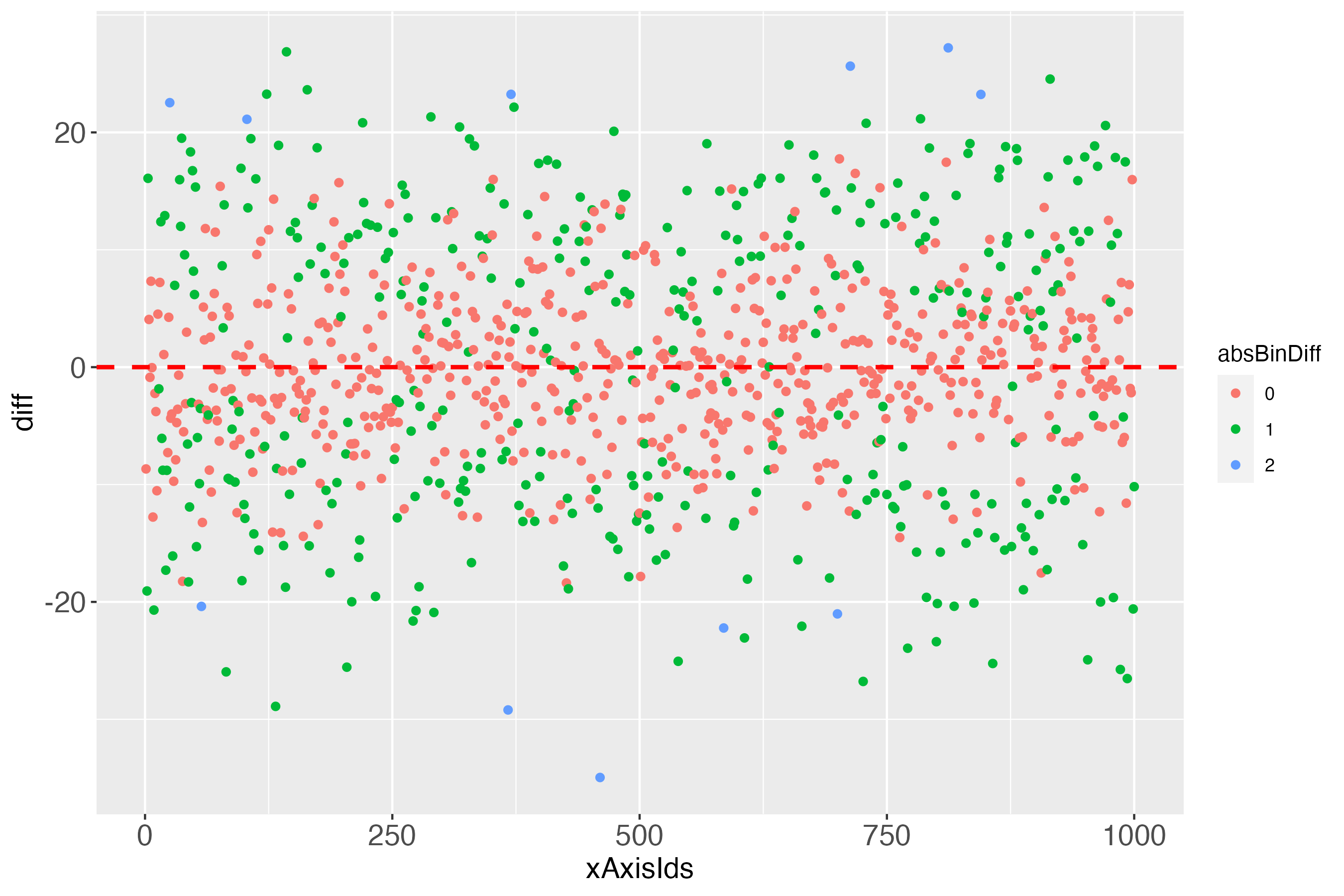
In the Details of the documentation of the function makeDiffPlotColor, I recommend to use the ggplot2 function facet_wrap, to make the colorized plot easier to comprehend:
# Use makeDiffPlotColor output and add a 'facet'
dpcFacet <- dpc$diffPlotColor + ggplot2::facet_wrap(~absBinDiff)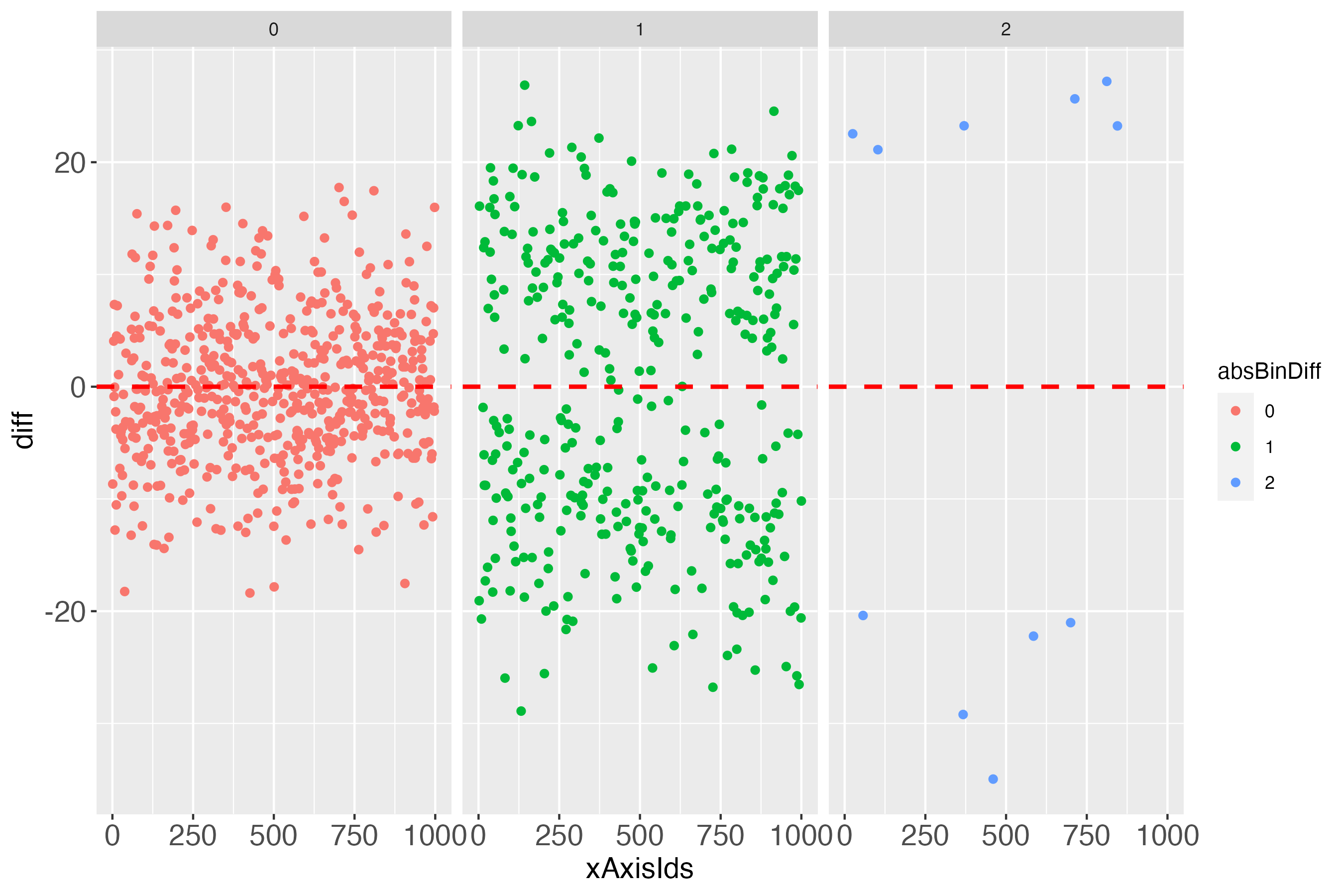
Such and probably many other detailed investigations could be conducted, if one wanted to focus on several aspects of the individual prediction performance, be it particularly accurate predictions or particularly inaccurate ones, or in between.
Notably, it might initially appear surprising that some differences of almost zero (close to perfect prediction) can be 1 bin away from the bull’s eye bin (green points in figure 7, very close to the dashed red line). The explanation for this is an individual’s measured outcome being very close to the border of one bin, e.g., 40.01, while the predicted outcome was very close to this border, but still in the lower bin, e.g., 39.99. For a further short discussion of this evident flaw, see headline ‘Bin noise’ at the bottom of this vignette.

Looks perfect (when using simulated data and a bin width of 20).
The main difference to using a continuous outcome is that the binary outcome does not need to be rescaled to range between 0 and 100. It merely needs to be multiplied by 100. That is, prediction research that uses binary outcomes, practically always use the so-called response as output. The response is the estimated probability that the outcome will take place. Probabilities by definition range between 0 and 1, which is why multiplying them by 100 returns these probabilities as a percentage.
In terms of visualizing the algorithm’s individual prediction performance, this is the exact same situation as to when the outcome was continuous (after being rescaled (linearly transformed) to range between 0 and 100).
# Simulate data set with binary outcome
dfBinary <- quickSim(type="binary")
# Use logistic regression as algorithm to predict the response variable
# (estimated probability of outcome being present).
glmRes <- glm(y~x1+x2,data=dfBinary,family="binomial")
# Extract measured outcome and the predicted probability (fitted values)
# from the logistic regression output, put both in a data.frame.
glmDf <- data.frame(measOutcome=glmRes$model$y,
                    fitted=glmRes$fitted.values)
# Apply function binBinary, set binWidth to 20.
x100b <- binBinary(x=glmDf, measColumn = 1, binWidth = 20)
Another difference between the binary and the continuous outcome is how to compare the algorithm’s predictions with the measured outcome. Having a continuous outcome, the algorithm predicts the outcome also on a continuous scale. This is not true of a binary outcome. The measured outcome is binary, whereas the predicted outcome is usually continuous (predicted probabilities that range between 0 and 1). Therefore, with the binary outcome, first the predicted probabilities are categorized into equal bins, after which the mean number of measured outcome events is computed for each bin. This is the basis for comparing the observed frequency of the outcome with the respective bin. Let’s look at the data to clarify what this means:
# Use part of the output of function binBinary, in particular: Display
# one row per bin (binWidth = 20 = 5 bins)
idx1RowPerBin <- match((1:5), x100b[["xTrans"]]$measOutcome)
# Display only the first 4 columns
x100b[["xTrans"]][idx1RowPerBin,1:4]
Output in R console
measOutcome fitted measOutcomePerc fittedPerc
3 1 1 7.692308 4.298254
17 2 2 31.313131 30.805328
16 3 3 46.987952 59.066078
12 4 4 66.666667 73.577654
1 5 5 95.333333 96.002061Ignore the line numbers 3, 17, …, 1.
For instance, the first bin of predicted probabilities (column fitted) ranges between 0 and 0.2 (or 0 and 20, in percent). In this bin, the mean number of measured events was 7.69 percent. This is the relative frequency of the binary outcome in this bin, that is, a constant number. The predicted probability, on the other hand (column fittedPerc) is not a constant number. The number 4.298 is only the first instance that was found, when using the function match (see previous code block). Let’s check the summary of predicted probabilities (fittedPerc) in the first bin to get an idea of their range.
Note that ‘the first bin’ in this specific vignette needs no further specification, because for the binWidth of 20, all predicted probability bins perfectly align with the bins of the relative frequencies of the measured binary outcome (see introductory heatmaps: Value 1 across the diagonal).
# Summary of column fittedPerc for the first bin
idxFirstBin <- x100b[["xTrans"]]$measOutcome==1
summary(x100b[["xTrans"]][idxFirstBin,"fittedPerc"])
Output in R console
Min. 1st Qu. Median Mean 3rd Qu. Max.
0.003784 0.990428 4.364189 6.311213 10.960193 19.756161In the first bin the predicted probabilities range between 0.004 percent and 19.76 percent.
For a well-performing algorithm, in the first bin we expect the mean number of the measured outcome to be somewhere between 0 and 20 percent. If this mean number in this bin was above 20 percent, this may cause us to be sceptical.
An algorithm might perform well in some bins, less well (or even bad) in others. Visualizing this with the predictMe package instantly reveals the strengths and weaknesses, in exactly the same way for binary outcomes and for continuous outcomes.
# Demand the visualized performance, using makeTablePlot
outLs <- makeTablePlot(x100b[["xTrans"]][,1:2], measColumn = 1, plot = TRUE)# Demand the visualized differences, using makeDiffPlot
outDiffLs <- makeDiffPlot(x100b[["xTrans"]][,5:6], idCol = 2)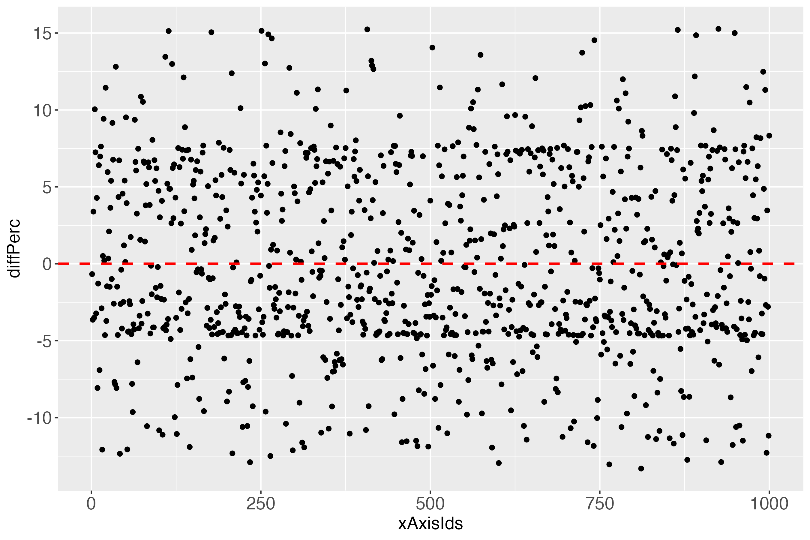
When looking at the individual differences (predicted probabilities in percent; see y-axis diffPerc), we see that perfection in one plot (the introductory heatmaps for the binary outcome) must not imply perfection in another plot, which - as noted - in the real (probabilistic) world is impossible.
This difference plot suggests, in combination with the perfect looking introductory heatmaps, that colorizing this difference plot would be futile. Let’s check: If the column absBinDiff has only one factor level, then colorizing would not make sense in terms of obtaining more detailed information, compared to figure 10.
# How many levels?
nlevels(x100b[["xTrans"]][,"absDiffBins"])
Output in R console
[1] 1As suspected, one factor level. Better use real data, I guess. But wait. Let’s just select more bins, say 25? Then check the number of levels (we want color, damn it!).
# Apply function binBinary, set binWidth to 4.
x100b4 <- binBinary(x=glmDf, measColumn = 1, binWidth = 4)
# How many levels?
nlevels(x100b4[["xTrans"]][,"absDiffBins"])
Output in R console
[1] 5Was that so hard?
How do the heatmaps now look like?
Interestingly, the more the individual level gets approached, the wider the gaps (lightest blue) along the diagonal become, at least with the simulated data.
# dpb: difference plot binary
dpb <- makeDiffPlotColor(x100b4[["xTrans"]][,5:7], idCol = 2, colorCol = 3)
# Use makeDiffPlotColor output and add a 'facet'
dpbFacet <- dpb$diffPlotColor + ggplot2::facet_wrap(~absDiffBins)

Introducing noise clearly is a flaw that comes with binning continuous data. However, researchers might still draw important information from the above visualizations. For instance, one might compute the percentage of cases in the sample that display this unwanted noise, and take this percentage into account when using the visual output to evaluate prediction performance on the individual level.
Regarding the intended purpose of the main visual output of the predictMe package, I choose to argue in favor of a method that presents potentially important information, where the inherent flaws are evidently visible, compared to a method without these (but other) flaws, which are very often implicit (not visible). I see a similarity, in some way, to what John Tukey said at the beginning of section 11 ‘Facing uncertainty’ (1962): ‘Far better an approximate answer to the right question, which is often vague, than the exact answer to the wrong question, which can always be made precise’.
For further explanations regarding the main intended purpose of this predictMe package, please see this package’s documentation, that is, in the documentation, click on the predictMe documentation. Alternatively, load the predictMe package, then enter in the R console: ?predictMe::predictMe
Final note: For demonstration purposes only, the full simulated data set (N = 1000) has been used both, for fitting the model and for evaluating the individual prediction performance. In machine learning (ML), this is the single most important mistake anyone can do. Therefore, if you want to use the predictMe package for your ML research, make sure that you extract the measured and the predicted outcome values of the so-called test cases only. The test cases are the individuals, with whom the trained (possibly tuned) algorithm was cross-validated, to obtain the estimates of the possible real world prediction performance of that algorithm.
References
Levitt, H. M., Surace, F. I., Wu, M. B., Chapin, B., Hargrove, J. G., Herbitter, C., Lu, E. C., Maroney, M. R., & Hochman, A. L. (2020). The meaning of scientific objectivity and subjectivity: From the perspective of methodologists. Psychological Methods. https://doi.org/10.1037/met0000363
Tuckey, J. W. (1962). The Future of Data Analysis. The Annals of Mathematical Statistics, 33(1), 1-67. https://www.jstor.org/stable/2237638
Wickham H (2016). ggplot2: Elegant Graphics for Data Analysis. Springer-Verlag New York. ISBN 978-3-319-24277-4, https://ggplot2.tidyverse.org.